

Artist Strategy
Color’s Role in Music Visuals: Turning Emotion Into Image
Color's Role in Music Visuals: Turning Emotion Into Image
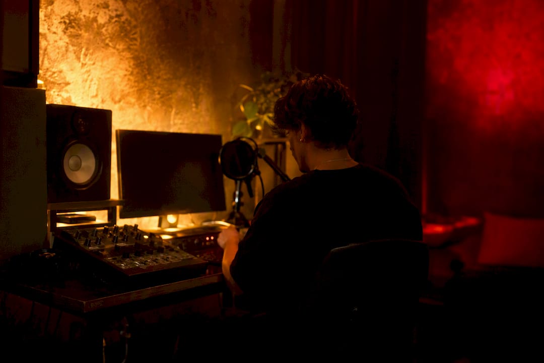
! Hands adjusting color grading controls in music studio
Color shapes how listeners interpret your song by mirroring its emotional valence and arousal.
By DRVVYN · · 23 min read

Color’s Role in Music Visuals: Turning Emotion Into Image

Color shapes how listeners interpret your song by mirroring its emotional valence and arousal. The relationship isn’t decorative. Peer-reviewed work, including a widely cited CIE Lab interface study, found that people match music to color primarily through shared emotion, not through any fixed hue-to-note formula. At DRVVYN Sound, that finding shapes every visualizer and video we build. So does the practitioner catalog inside the Fixation database of music-video frames, which shows the same structural color patterns surfacing again and again across genres.
Here’s the practical version of that research: color should amplify what a song already feels like, not contradict it. A slow, minor-key ballad rarely benefits from a hot magenta palette, no matter how striking it looks in isolation. Once you accept that color reinforces rather than rewrites emotion, the creative decisions get simpler.
Before you touch a color wheel, do this:
- Name the song’s emotional valence (positive or negative) and arousal (calm or intense).
- Choose one dominant palette family that matches that emotional read.
- Plan a single deliberate shift, in saturation, hue, or brightness, for the chorus or bridge, so the visual has somewhere to go.
Everything else in this guide builds on those three moves.
Key Takeaways
Color functions as an emotional amplifier for music visuals, mapping to a song’s valence and arousal rather than operating as an independent creative layer.
| Point | Details |
|---|---|
| Emotion drives the mapping | Arousal and valence, not tempo or genre alone, predict which colors listeners associate with a track. |
| Reinforce, don’t override | Hue-only changes rarely shift perceived musical arousal; saturation, brightness, and structure matter more. |
| Use structural templates | Half-and-half, songwriter palettes, and entropy give reproducible frameworks for pacing color across a song. |
| Protect skin tones and accessibility | Aggressive grades should never distort skin tone or collapse under color-blindness simulation. |
| Test before you lock the grade | Short cut comparisons, color-barcode timelines, and multi-device checks catch problems early. |
The Role of Color in Music Visuals: What the Science Says
Three separate lines of experimental research point to the same conclusion: emotion is the bridge between what you hear and what color you picture, not pitch, tempo, or genre in isolation. Researchers call this the emotional mediation hypothesis, and the numbers behind it are stronger than most creatives expect.
In the foundational CIE Lab interface study, participants listened to musical excerpts and selected colors using a controlled digital color space. Faster, major-mode pieces pulled toward lighter, more saturated, yellower colors. Slower, minor-mode pieces pulled toward darker, bluer, desaturated ones. The correlations were not subtle. Ratings of happy versus sad music tracked color choice with very high correlation coefficients, and lively versus dreary tracked similarly strongly, effect sizes that would make most social-science researchers do a double take. The pattern held across both US and Mexican participant samples, which suggests the mechanism runs deeper than any single culture’s color symbolism.
A broader synthesis of this research confirms the pattern isn’t an artifact of one lab or one song list. Across multiple experiments and excerpt sets, arousal and valence consistently outperformed other musical features as predictors of color choice. That matters for how you should think about your own creative process: you’re not trying to translate a chord progression into a hex code. You’re translating a feeling.
The mediation effect held up even when researchers controlled for surface-level musical features. A multi-genre follow-up study partialled out lower-level acoustic properties, tempo, timbre, and pitch, and found that once emotional ratings were accounted for, the direct correlations between those raw features and color choice largely disappeared. Emotion wasn’t just correlated with the color match. It was doing the actual mediating work.
What this means for your storyboard:
- Arousal (how energized or calm a track feels) tends to map onto saturation and brightness.
- Valence (how positive or negative a track feels) tends to map onto hue family, warm versus cool.
- The strongest color-to-music matches happen when both dimensions are considered together, not one in isolation.
- Genre labels are a weak predictor on their own; a slow, sad trap song and a slow, sad folk song can call for a similar palette despite sounding nothing alike.
The research has real boundaries, though, and a good creative director respects them as much as the headline numbers. Most of these studies used static color selection tasks or short excerpts, not full-length videos with camera movement, lighting, and performer expression competing for attention. When researchers moved from color-picking tasks to actual moving video, the picture got more complicated. One experiment that overlaid a single hue, red versus blue, onto piano performance footage found no significant shift in perceived arousal across two trials with 106 participants. The music and the performer’s physical energy simply dominated the emotional read. Hue alone, applied as a flat filter, wasn’t strong enough to move the needle.
That’s not a contradiction of the earlier findings. It’s a scope limitation worth internalizing: color’s persuasive power seems strongest when it’s paired with music in a low-distraction, low-competing-stimuli context (a still image, a short clip, a color-selection task) and weaker when it’s fighting for attention against tempo, lyrics, and human movement. Design with that in mind, and you’ll avoid the rookie mistake of expecting a color grade to single-handedly rescue a mismatched edit.
Synesthesia Versus Everyday Color Association
Synesthesia is a distinct neurological condition where sound genuinely triggers a color perception, not a metaphor, not a learned habit, but an involuntary sensory crossover. Chromesthesia, the sound-to-color variant, affects a small minority of the population, and it’s fundamentally different from the emotion-mediated associations most listeners share.
The confusion is understandable, and it comes up constantly in creative conversations about music videos. Lady Gaga has spoken publicly about experiencing synesthesia, describing specific songs as having specific colors attached in her perception. Pharrell Williams has described something similar. These artist accounts get amplified in music press, and that’s partly why the question “does color really connect to music” gets tangled up with a much rarer phenomenon than the one most creatives actually need to understand.
Here’s the practical distinction that matters for your work:
- Synesthesia is involuntary and highly individual. A synesthete’s blue might be another synesthete’s green for the exact same chord.
- Emotion-mediated association is the population-level pattern documented in the CIE Lab research: most people, synesthete or not, tend to agree that fast major-key music feels more at home with saturated warm colors, and slow minor-key music feels more at home with desaturated cool ones.
- The first is a private sensory experience. The second is a shared cultural and emotional pattern you can design toward with confidence.
Should you borrow synesthetic color logic for a mainstream video? Sparingly, and only if it’s your own artist’s lived experience rather than a gimmick borrowed from someone else’s neurology. If your artist genuinely does experience sound-to-color crossover, that personal mapping can become a compelling, authentic visual signature, something worth building an entire aesthetic identity around. But manufacturing a fake synesthetic system for a project just because it sounds artistically credible tends to produce visuals that feel arbitrary to everyone except the person who invented the rule. Audiences can’t feel a private mapping they weren’t born with. They can feel emotional coherence. Build for the latter, and treat true synesthetic mapping as a rare, personal bonus layer rather than your primary design tool.
How to Build a Color Strategy for Music Visuals
Once you’ve read a song’s emotional temperature, the next step is translating that read into concrete visual decisions, palette, saturation, contrast, and movement, that a director of photography or motion designer can actually execute.
1. Match your dominant palette to valence and arousal together by exploring curated mood pairings. High-arousal, positive-valence tracks (upbeat, major-key, driving) tend to read well with warm, saturated colors: amber, gold, coral, saturated red. Low-arousal, negative-valence tracks (slow, minor-key, sparse) tend to read well with cool, desaturated colors: muted blue, slate, deep indigo. This isn’t a rigid formula, it’s the direction the emotion-mediation research consistently points, and it gives you a defensible starting point instead of a blank canvas. See examples on Match Your Mood.
High-arousal, positive-valence tracks (upbeat, major-key, driving) tend to read well with warm, saturated colors: amber, gold, coral, saturated red. Low-arousal, negative-valence tracks (slow, minor-key, sparse) tend to read well with cool, desaturated colors: muted blue, slate, deep indigo. This isn’t a rigid formula, it’s the direction the emotion-mediation research consistently points, and it gives you a defensible starting point instead of a blank canvas.
2. Apply the 60-30-10 rule to keep the palette from turning muddy.
Borrowed from interior design and cinematography alike, this rule allocates 60% of the frame to a dominant color, 30% to a secondary supporting color, and 10% to an accent that draws the eye. In a music video, your dominant color usually lives in the environment and wardrobe, your secondary color in lighting and set dressing, and your accent in a single deliberate detail, a red light cue, a gold prop, a flash of saturated color at the emotional peak of the frame.
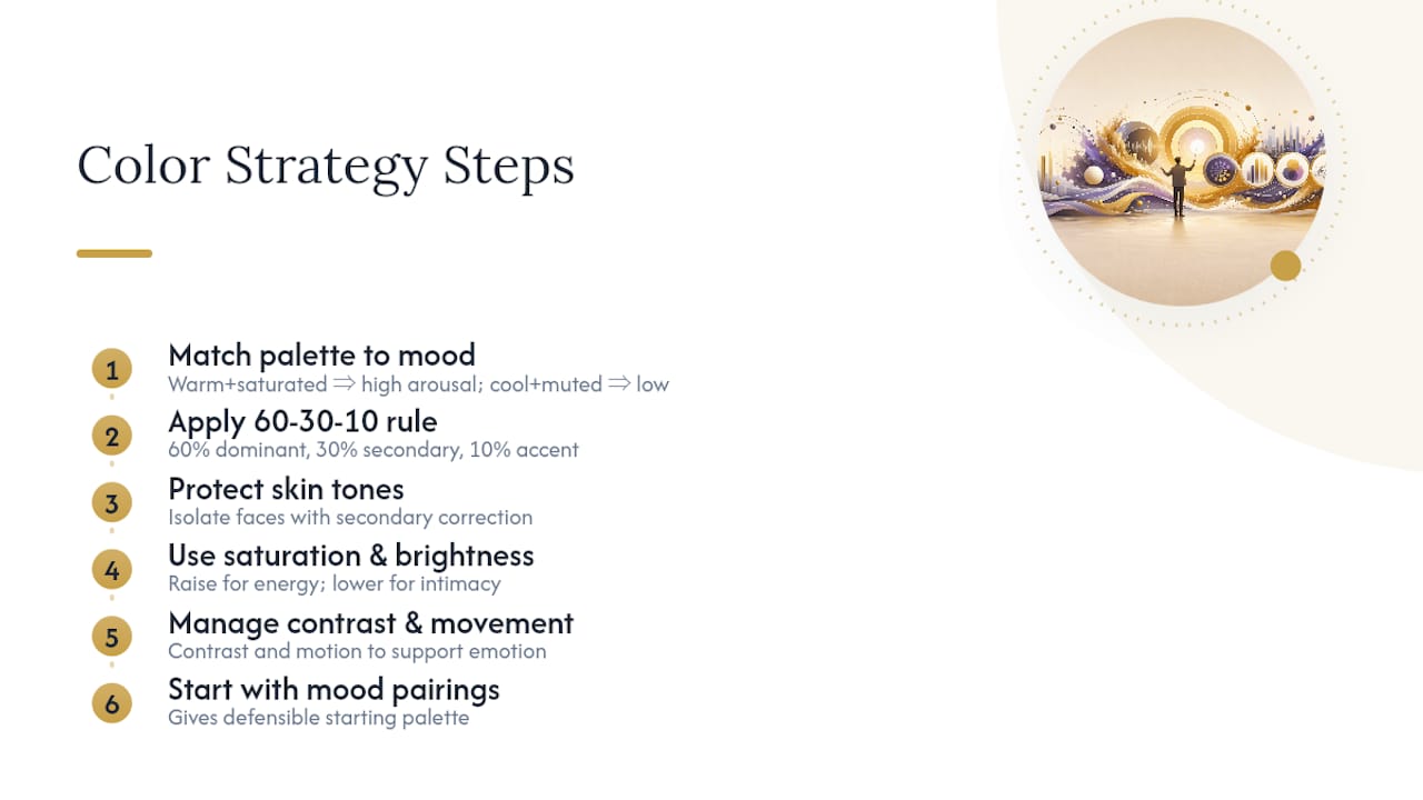
3. Protect skin tones no matter how aggressive the grade gets.
This is the mistake that separates amateur color grading from professional work. A cool blue grade that turns every performer’s skin sickly green or ashen undercuts the emotional intent, no matter how well the palette theory checks out on paper. Skilled colorists build a look around the skin tone, not despite it, using secondary color correction to isolate faces before pushing the rest of the frame toward mood.
4. Use saturation and brightness as your arousal dial, not just hue.
The hue-overlay study found that swapping red for blue alone didn’t move perceived arousal much. But saturation and brightness function more like a volume knob for emotional intensity. Pushing saturation and contrast up tends to read as heightened energy; pulling both down tends to read as intimacy or melancholy, regardless of which hue family you’re in. If a chorus needs to feel like it’s opening up, raise saturation and brightness together rather than reaching for an entirely new color.
5. Use split-toning to separate your shadows from your highlights emotionally.
Split-toning, pushing shadows toward one hue family and highlights toward another, lets you build tension into a single frame. A common move: cool blue shadows with warm amber highlights, which lets a video feel emotionally layered even in a static shot, longing in the dark areas, warmth in the light. This technique shows up constantly in the color-rhythm patterns cataloged in the Fixation database of music-video frames, where creators use split-toning to keep a single palette from feeling flat across a full track.
6. Think in visual consonance and dissonance, not just color swatches.
Research on consonance and dissonance in visual music frames color choice as one lever among several, alongside composition stability, proportion, and motion, for mirroring musical tension and release. A dissonant chord in the music can be echoed with a jarring color clash or an unstable frame composition; its resolution can be echoed with color harmony and a settled, centered shot. That gives you tools beyond the palette itself when the music demands more than a hue change can deliver.
Pro Tip:Build your palette reference board before you shoot or animate a single frame. Pull five to seven still images that match the emotional target, then check that your actual footage or motion graphics land within that same saturation and brightness range under real playback conditions, not just on your color-calibrated editing monitor.
Stage lighting professionals already apply a version of this logic instinctively. Lighting designers report leaning toward red and warmer washes for higher-arousal songs and blue or cooler washes for lower-arousal ones, a pattern that lines up with what the lab research on perceived arousal documents. Practice and research arrived at the same conclusion from opposite directions.
Mapping Color to a Song’s Structure
A static palette works for a still image. A full song needs a plan for how color moves across verses, choruses, bridges, and drops, because a track’s energy rarely stays flat for three straight minutes.
Analysis of large collections of music-video frames, cataloged in the Fixation database, keeps surfacing the same handful of structural color patterns. Three are worth learning by name because you’ll recognize them the moment you see them applied:
- Half-and-half splits the video’s color identity roughly down the middle, one dominant palette for the first half, a contrasting one for the second, often timed to a key structural pivot like a bridge or beat switch.
- Songwriter palette assigns a distinct but related color family to each section, verse, chorus, bridge, so the video reads almost like a color-coded lyric sheet, with the audience learning to associate a specific hue with a specific emotional beat before the song even resolves.
- Entropy starts controlled and desaturated, then gradually loosens into higher saturation, more color variety, and more visual chaos as the track builds toward its climax, mirroring an arrangement that thickens over time.
None of these patterns is universally correct. Half-and-half suits songs with one dramatic tonal pivot. Songwriter palettes suit songs with clearly differentiated sections and strong lyrical hooks. Entropy suits builds and drops, the kind of arrangement where the last chorus is meant to feel like release after sustained pressure.
Here’s a repeatable method for applying any of them to your own track:
- Chart the energy curve. Mark every tempo shift, dynamic drop, and arrangement change on a simple timeline, even a rough sketch works, so you can see where the emotional peaks and valleys actually sit.
- Choose your dominant color family per major section, based on that section’s own valence and arousal, not the song’s average mood. A quiet bridge inside an otherwise upbeat track deserves its own cooler moment.
- Plan your color transitions at musical cues, not at arbitrary edit points. The chorus arrival, a lyrical hook, an instrumental drop-out, or a tempo shift are natural places for a palette to shift; changing color mid-verse for no musical reason breaks the mapping the audience is unconsciously tracking.
- Refine with saturation and contrast ramps rather than swapping hues entirely between sections. A gradual increase in saturation across a bridge into a chorus reads as build; an abrupt total palette swap can feel jarring unless that jarring quality matches a deliberate structural break in the song itself.
- Test the full timeline as a color-quantized strip. Tools that extract dominant colors per frame into an aggregated timeline let you see your entire video’s palette rhythm at a glance, which makes unintended drift or accidental repetition obvious before your grade is locked.
The half-and-half and entropy patterns work as starting templates precisely because they’re reproducible. You don’t need to invent a new color language for every release. You need to recognize which existing pattern matches your song’s shape, then execute it with discipline.
Where Color Strategy Breaks Down (and How to Test Before You Commit)
Color reinforces music. It rarely overrides it, and treating color as a fix for a mismatched edit or a weak performance is the single most common overreach in this space. The hue-overlay experiment showing no significant arousal shift from a red-versus-blue swap is the clearest evidence for this limit: if the underlying footage and music aren’t emotionally aligned, a color grade alone won’t manufacture that alignment after the fact.
A handful of mistakes show up again and again in music-video color work, and most of them are avoidable with a second look before final delivery:
- Leaning on genre clichés instead of the song’s actual emotion. Trap videos don’t have to be purple and neon just because other trap videos are; a slower, more introspective track within that genre deserves its own read.
- Ignoring color-blindness accessibility, which affects a meaningful share of any general audience and can flatten red-green or blue-yellow contrast schemes into visual mush for those viewers.
- Breaking skin tones under an aggressive grade, covered above, but common enough to repeat here as its own checklist item.
- Inconsistent grading across deliverables, a warm, saturated main video paired with a cool, desaturated Instagram teaser confuses the visual identity you’re trying to build around a release.
- Treating one visual stereotype as a permanent identity rather than choosing it deliberately for a specific song’s message, a pattern practitioner research on visual stereotypes in music marketing flags as a recognition shortcut that can calcify into lazy shorthand if it’s never revisited.
Before you lock a color grade, run it through a short, practical test pass:
- Export a 15-second cut from your highest-energy section and your lowest-energy section, and watch both back to back to confirm the contrast actually reads as intended.
- Generate a color-barcode or frame-by-frame color extraction of the full timeline to catch unintended palette drift between shots or scenes.
- Check the grade on at least two different devices, a phone screen and a calibrated monitor, since most of your audience will watch on the former.
- Get a fresh pair of eyes, ideally someone who hasn’t heard the track twenty times, to describe the emotional feel of the visuals with the sound muted. If their read doesn’t match the song, the color is working against you.
Pro Tip:If you only have time for one accessibility check before delivery, run your final grade through a color-blindness simulator filter. It takes minutes and it catches contrast failures that a fully sighted editor will never notice on their own screen.
How DRVVYN Sound Applies Color Strategy in Practice
DRVVYN Sound builds every visualizer and music video around the same emotional-mapping logic outlined above, starting with the song’s emotional read, not with a mood board pulled from unrelated references. A slower, reflective release calls for a desaturated, cooler palette that gives the vocal room to breathe. A track built around momentum and release calls for saturation ramps that climb toward the chorus, echoing the arrangement’s own build.
That process follows a consistent internal workflow, one any creative team can adapt regardless of budget or software stack:
- Analyze the song’s emotional arc first, mapping valence and arousal section by section before a single visual reference gets pulled.
- Select a dominant palette family based on that emotional read, then commit to one deliberate shift for the track’s clearest structural pivot.
- Storyboard the color transitions against musical cues, tempo changes, hooks, drop-outs, rather than against arbitrary shot lengths.
- Grade, then test, using the same 15-second comparison and multi-device check described above before anything ships.
Readers can see this approach applied directly across DRVVYN Sound’s video catalog, and pieces like Why Music That Feels Cinematic Stays With Us go deeper into how cinematic techniques, color included, extend a song’s emotional intent past the audio alone. If you’re trying to identify a track’s emotional core before you touch a color wheel, the same mood-mapping logic covered in how to find music that fits your mood applies just as well to matching visuals to a song as it does to matching songs to a listener.
| Workflow step | What it accomplishes |
|---|---|
| Map emotional arc | Identifies valence and arousal shifts before any visual choice is made |
| Choose dominant palette | Anchors the video in one coherent color family tied to the song’s overall mood |
| Storyboard at musical cues | Times every color transition to a structural moment, not an arbitrary edit |
| Grade and test | Confirms the finished palette reads correctly across devices and audiences |
Tempo, Mode, and the Color Patterns Listeners Expect
Fast, major-key music consistently pulls toward lighter, more saturated, yellower colors in the emotional-mediation research, the kind of palette that reads as upbeat and open even before a single frame of footage plays. Slow, minor-key music pulls the opposite direction: darker, bluer, more desaturated. Arousal drives the saturation and brightness axis; mode and valence drive the warm-versus-cool axis. Together, those two dimensions explain most of the color intuition experienced listeners already have, even if they’ve never articulated it in these terms.
Mid-tempo tracks in a major key tend to sit somewhere between those extremes, often reading well with warm but moderately saturated tones, terracotta, muted gold, dusty rose, rather than either bright yellow or deep blue. A minor-key track with unusually high tempo (think a driving, anxious energy rather than calm sadness) is where the simple mapping gets interesting: high arousal pushes toward brighter, more saturated color, but negative valence pulls toward cooler hues, which often produces striking palettes built around saturated reds, magentas, or violets rather than a clean yellow or blue. Those tension-built palettes tend to feel appropriately unsettled, which is exactly the point.
Historical and Cultural Threads in Music-Visual Color
Album cover art carried most of the color-storytelling burden for decades before music video existed as a format, and psychedelic rock’s saturated, swirling palettes in the late 1960s set a template that still echoes in visualizer design today. MTV’s 1980s arrival pushed color into motion for the first time at scale, and the era’s neon, high-contrast aesthetic became so tied to the decade’s music that the palette itself now functions as a cultural shorthand for that period.
Genre has built its own color vocabulary over time, often independent of the emotion-mediation patterns documented in lab research. Metal and industrial music leaned toward desaturated grays and stark contrast long before any study confirmed low-arousal color associations, driven partly by production budgets and partly by subculture identity. Hip-hop’s relationship with saturated jewel tones and gold accents traces back to the genre’s visual language around status and craft, a cultural association layered on top of, not purely derived from, the music’s tempo or mode.
These inherited associations matter because audiences bring them into every viewing. A viewer’s genre expectations can either reinforce or fight against the emotion-mediated palette you choose, which is why the strongest visual choices tend to work with cultural shorthand rather than ignoring it outright, borrowing a genre’s established color identity while still tuning saturation and brightness to the specific song’s emotional arc rather than the genre’s average.
Color’s Different Job Across Live Shows, Video, and Album Art
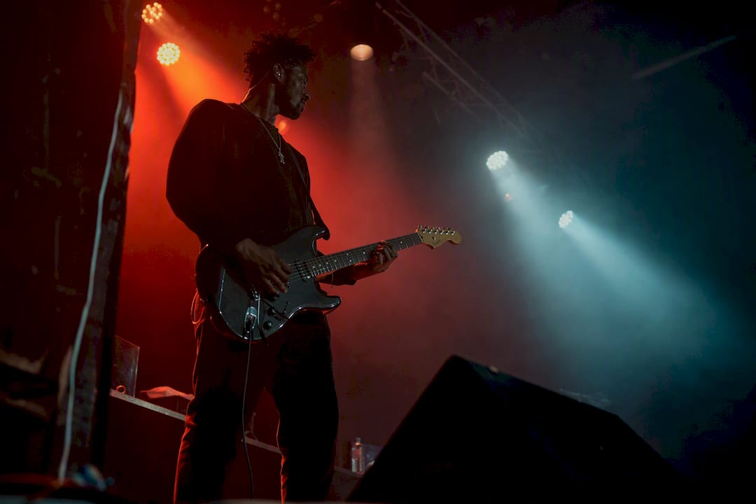
Color performs a different function in each format a piece of music travels through, and treating all three the same is a common miscalculation. Live concert lighting operates in real time, changing shot by shot with the performance, and lighting designers already lean toward warmer washes for high-arousal songs and cooler washes for lower-arousal ones, a pattern that lines up with the research on perceived musical arousal. But live color also has to read correctly from the back row of an arena under variable ambient light, which limits how subtle a palette can afford to be.
Music video color operates with far more control. Every frame can be graded, every transition planned in advance, which is exactly why the structural patterns covered earlier, half-and-half, songwriter palettes, entropy, are achievable in video in a way they simply aren’t in a live setting. Video also has to hold up across wildly different viewing conditions, a phone screen at low brightness versus a calibrated monitor, which is why device testing matters more here than anywhere else.
Album art carries the heaviest single-image burden of the three: one static frame has to communicate a record’s entire emotional identity before a listener has heard a single note. That’s a fundamentally different design problem than pacing color across a four-minute video, closer to a poster than a film, and it explains why album covers often lean into a single bold, saturated statement rather than the gradual color arcs that work well across a moving timeline.
Designing for Color Blindness in Music Visuals
Roughly 1 in 12 men and 1 in 200 women experience some form of color vision deficiency, most commonly red-green deficiency, which means a meaningful share of any general audience won’t perceive certain contrast choices the way a fully sighted colorist intends. A video built entirely around a red-versus-green tension, a common dramatic device, can collapse into a muddy, indistinguishable field for those viewers, undercutting exactly the emotional beat that contrast was meant to deliver.
The fix isn’t abandoning color drama. It’s building contrast on more than one axis at once. Pairing a hue shift with a brightness or saturation shift, rather than relying on hue alone, preserves the visual distinction for color-blind viewers even when the specific hues blur together. This is the same principle covered earlier around saturation and brightness functioning as an arousal dial independent of hue, and it happens to double as an accessibility safeguard.
A quick, low-cost check before final delivery: run your graded footage through a color-blindness simulation filter, widely available in editing software and as standalone tools, and confirm your key contrast moments still read. If a critical transition depends entirely on distinguishing red from green, or blue from purple, rework it with a brightness or saturation cue layered underneath before you ship.
Software and Tools Creatives Use to Implement Color
Professional color grading for music video work typically runs through dedicated grading software, tools built specifically for adjusting saturation, contrast, hue, and split-toning across a full timeline with frame-accurate precision, alongside broader video editing suites that handle the surrounding cut. For visualizers and generative visual work, motion graphics and real-time visual software let creators tie color parameters directly to audio input, so saturation or hue can shift dynamically with a track’s actual waveform or frequency data rather than requiring a fully manual keyframe for every beat.
Beyond the editing suite itself, color-quantization tools that extract a dominant palette per frame into an aggregated visualization give creators an objective way to preview an entire video’s color rhythm before committing to a final grade, catching palette drift that’s easy to miss watching in real time. Color-blindness simulation filters, often built into editing software or available as standalone plugins, serve the accessibility check covered above. And practitioner reference resources like the Fixation database’s pattern catalog function less as software and more as a structural reference library, useful during the storyboarding phase before any grading tool gets touched at all.
Selected Research and Practitioner Resources
For readers who want to go deeper than a single guide can cover, these sources shaped the guidance above and reward a closer read.
- The CIE Lab interface study remains the clearest single source for the correlation strength between musical emotion and color choice.
- The expanded multi-genre replication confirms the pattern holds once lower-level acoustic features are controlled for.
- The hue-overlay arousal experiment is essential reading for understanding where color’s influence has real limits.
- The Fixation database’s music-video pattern catalog offers the clearest practitioner-level view of recurring structural color templates.
- DRVVYN Sound’s video catalog shows this research applied directly to finished visual work.
What Actually Matters When You Design With Color
Most advice on this topic treats color like a lookup table, sad song equals blue, happy song equals yellow, as if the job were translation rather than judgment. That undersells what the research actually supports. Arousal and valence explain the pattern, but they don’t tell you where to put your one deliberate palette shift, and that single decision usually matters more than which exact hue you picked.
The overrated move is chasing a “correct” color for a genre or mood. The underrated move is building one clear transition tied to a real musical cue, a hook, a drop, a bridge, and protecting it with saturation and contrast rather than a wholesale hue swap. Creatives who test their grade against a fifteen-second high-energy cut and a fifteen-second low-energy cut, side by side, catch more real problems than those who trust their eye on a calibrated monitor alone.
Prioritize the emotional read first, the structural template second, and the hue itself last. That order, more than any specific palette choice, is what separates visuals that support a song from visuals that just sit next to it.
Sources
- Colour Association with Music Is Mediated by Emotion: Evidence from an Experiment Using a CIE Lab Interface and Interviews
- Colour association with music is mediated by emotion (expanded multi-genre study)
- The effect of hue on perceived arousal in music performance videos
FAQ
How are colors related to music?
Colors relate to music primarily through shared emotional associations rather than any direct sensory link. Research using controlled color-selection tasks found that faster, major-key music correlates with lighter, more saturated, warmer colors, while slower, minor-key music correlates with darker, cooler, desaturated ones.
Does Lady Gaga have synesthesia?
Lady Gaga has spoken publicly about experiencing synesthesia, describing certain songs as having specific colors attached in her own perception. That’s a personal neurological experience, distinct from the population-level emotional color associations most listeners share.
What is the 3-color rule and how does it work?
The closest widely used framework is the 60-30-10 rule, allocating 60% of a frame to a dominant color, 30% to a secondary color, and 10% to an accent that draws the eye. It keeps a music video’s palette from feeling either flat or chaotic across a full timeline.
What is the representation of color in music visuals?
Color in music visuals represents emotional information, primarily valence and arousal, translated into palette, saturation, and contrast choices. Structural patterns like half-and-half shifts, songwriter palettes, and entropy give creators reproducible ways to pace that representation across a full song.
Do colors influence how we perceive music, or just reflect it?
Color mainly reflects and reinforces the emotion already present in the music rather than independently changing it. A controlled experiment overlaying red versus blue onto performance footage found no significant shift in perceived arousal, indicating hue alone rarely overrides what the music and performer are already communicating.